When an organization like Leadership Greater Hartford (LGH) evolves, its brand should reflect that growth. We partnered with the LGH team to craft a new identity system that’s as forward-looking, energetic, and community-centered as their mission.
Challenge
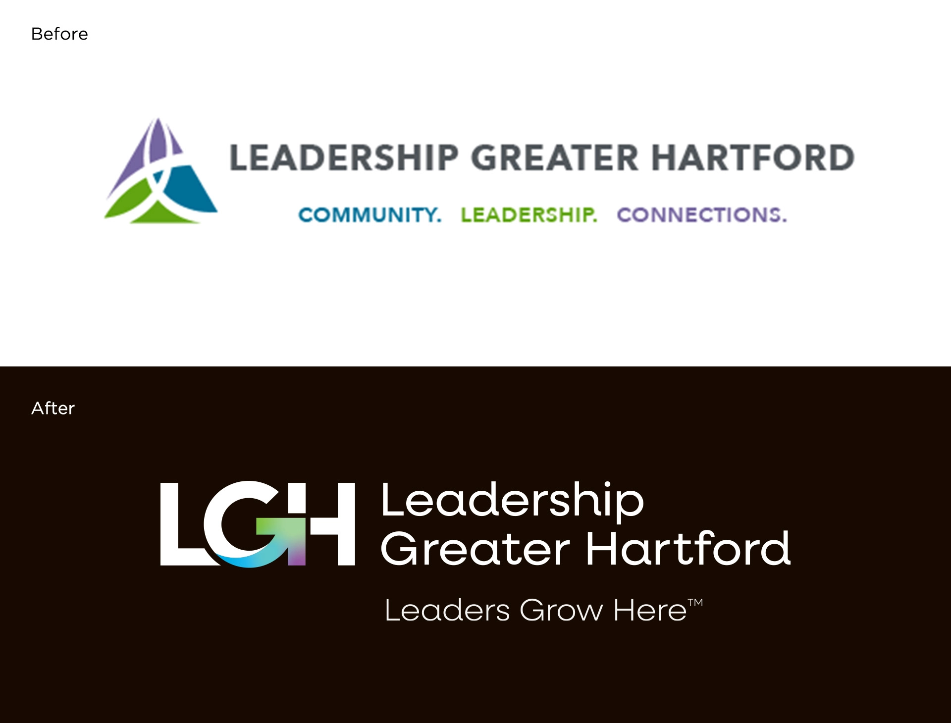
Over time, LGH’s existing logo and brand elements began to lose clarity and flexibility — especially in digital contexts. Inconsistent spacing, a lack of scalable structure, and diminished name recognition meant it was time for a refresh.
Our Approach
We began with a clear goal: Embrace the acronym LGH and build a brand that embodies leadership, growth, and upward momentum
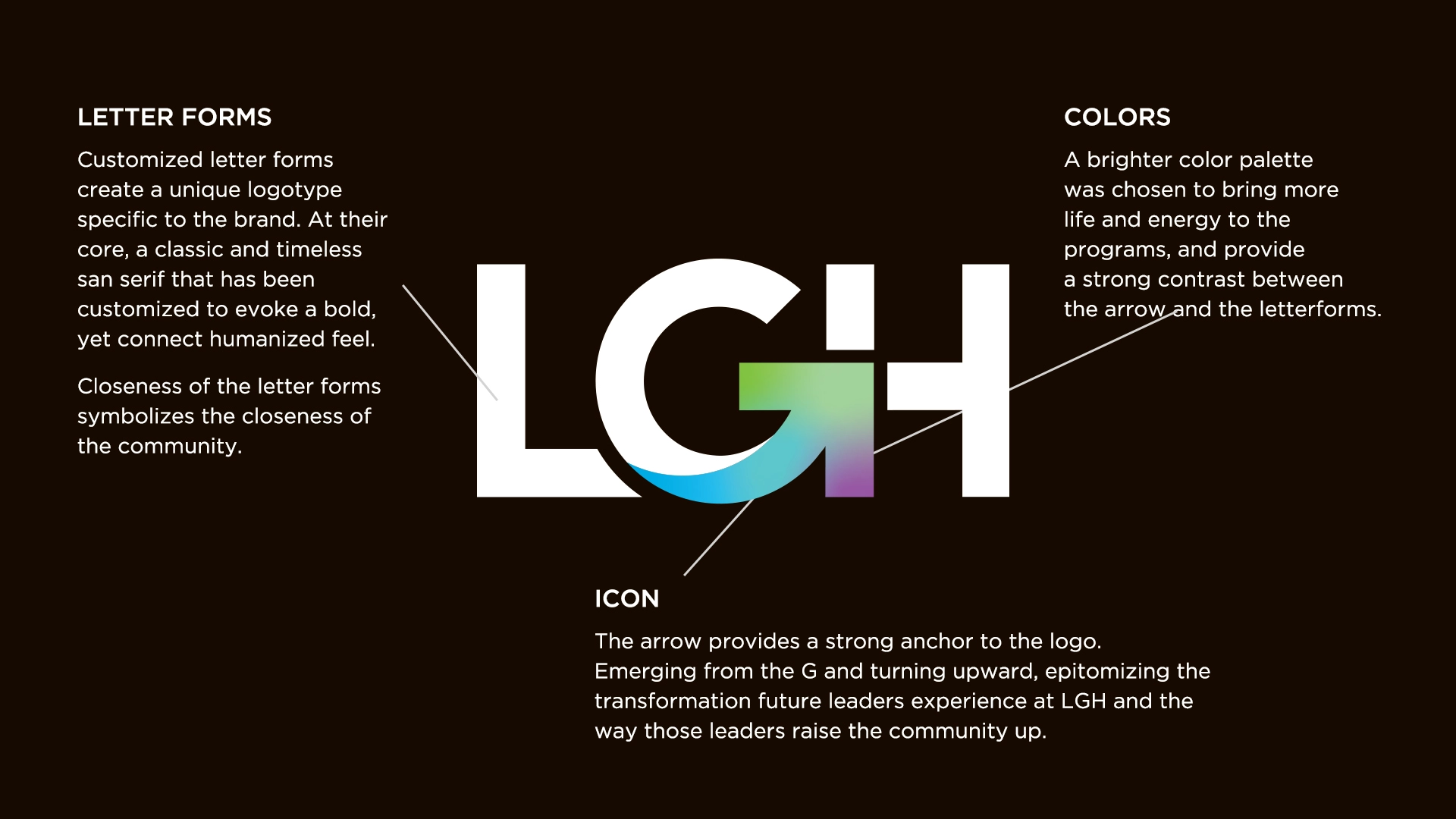
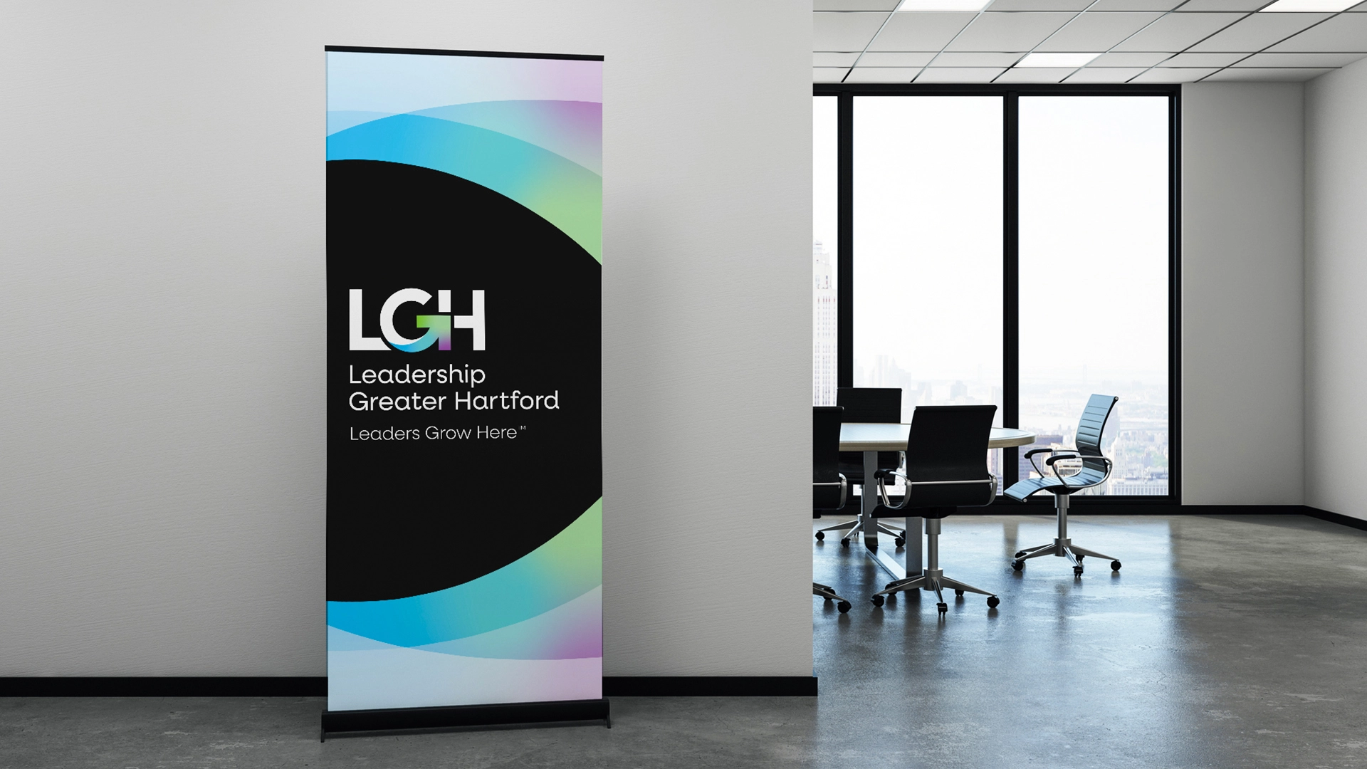
✦ A New Logo, Rooted in Purpose
The redesigned mark features an upward arrow, emerging from the “G” — a visual metaphor for leadership that lifts others and grows from within. It also accentuates the the core mission of the organization which is for "a greater Hartford"
✦ Customized Lettering
The logotype is both bold and approachable, with customized letterforms that reflect LGH’s close-knit, human-centered community.
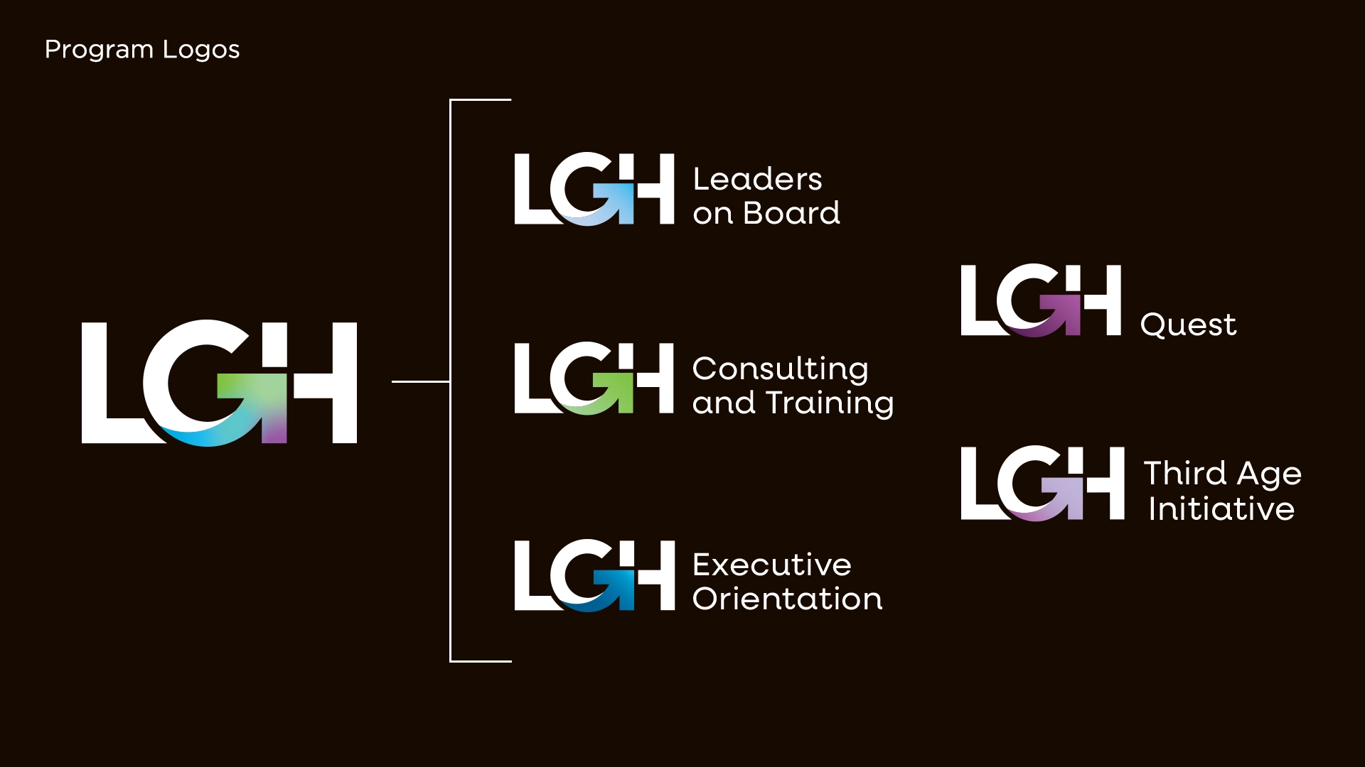
✦ A Flexible System
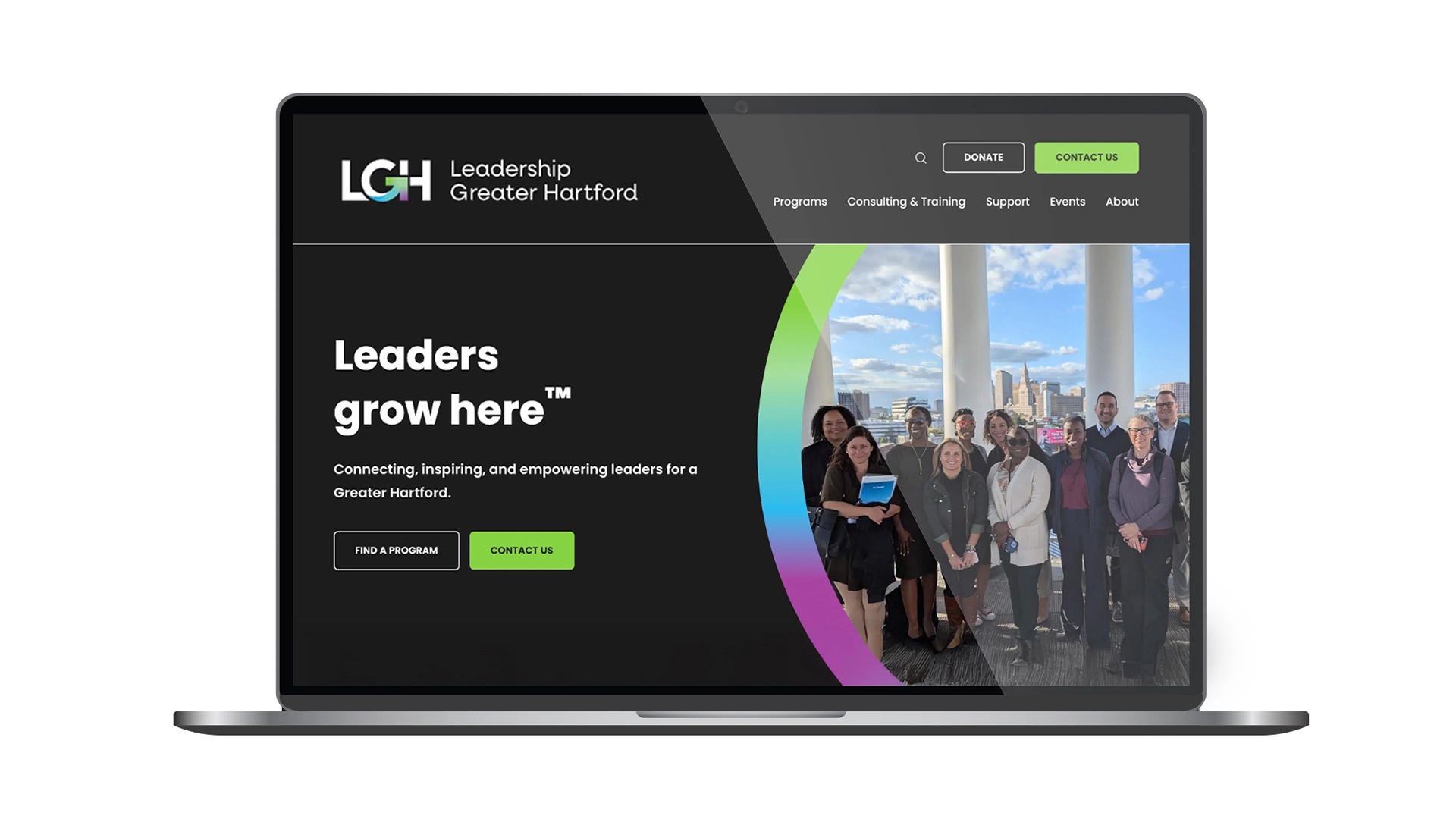
From the core identity to program sub-brands, this system scales seamlessly across web, print, and social — all unified by the rallying message and leans into their acronym (LGH): “Leaders Grow Here."
✦ A Brighter, Energized Palette
We introduced a refreshed, vibrant color system that brings life to LGH’s diverse programs and makes the brand more engaging across channels.
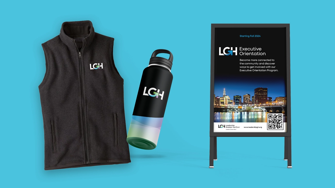
See It in Action
Explore the new LGH brand in the wild — including their redesigned website and a glimpse at how this identity empowers every touchpoint.
The icon says so much in a small space... These colors represent our three pillars of community, leadership and connections, but they also converge – much in the same way that LGH programs bring folks of all identities and experiences together to develop and learn... Thank you so much to Chad and his incredible team at GO – we love how thoughtfully you reflect who we are as an organization in a strategic (and snazzy!) way.
LARISA KOTTKEPresident & CEO of Leadership Greater Hartford